Piggy Pay Exchange
OVERVIEW
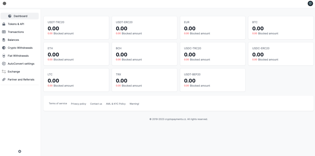
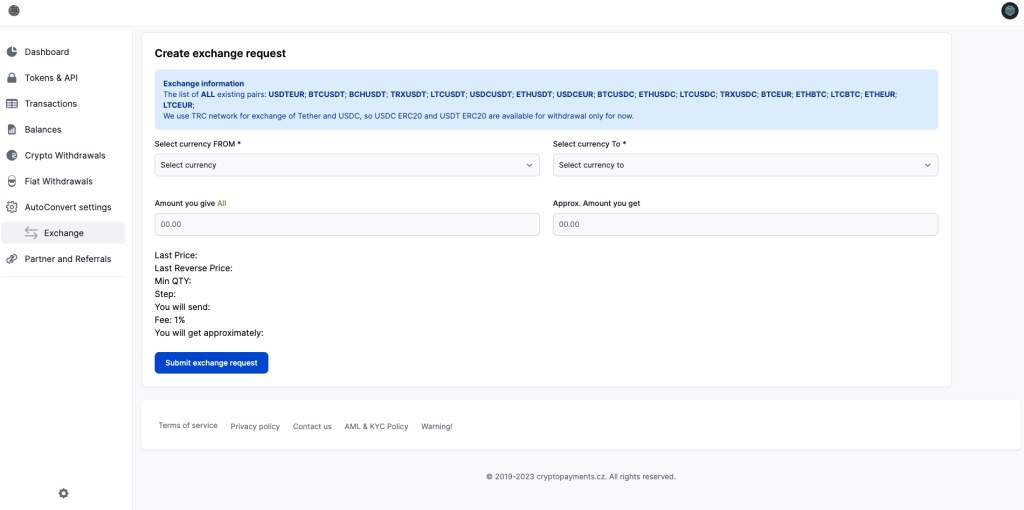
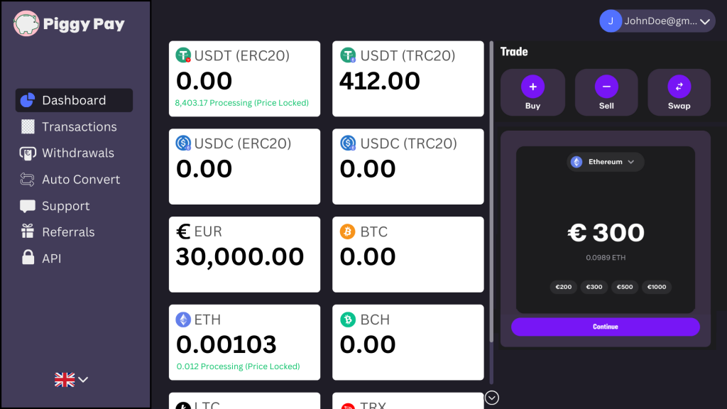
This client hired me to revise (and then market) their website and, while it wasn't directly a game design project, I applied the UX/UI principles I had learned from games to this platform without any trouble. I started my work like any other project: with a market analysis, a mockup, and a rapid prototype. The above screenshot is my own mockup made in Canva and 2 examples from the previous website can be compared below. It depicts an exchange platform where users can trade cryptocurrency for fiat currency. I enjoyed working on this project because it allowed me to express some of my UI principles very concisely. I'll share my top 3 here, and please reach out if you want to talk shop. I could go on endlessly and I'm always happy to learn from others!
Colors tell a story.
Every color needs to convey a message and attract (or divert) attention at the right time.
I started with a dark design, a strong and necessary departure from the original all-white dashboard. Web3 boasts one of the highest dark-mode friendly communities on the internet and helped to pioneer the feature across desktop sites and mobile apps. If I had to choose between dark and light for this page, I wouldn't even hesitate.
I also 'activated' the currently selected menu icon by using the brand's color to draw it out. I also used the brand's color to draw attention to the active buttons on each page: in this case, select a currency, trade, and continue (and change language). Anything not directly linked to the page's current activity was given a monotone shade. This principle in game design allows users to engage more and convert stronger when purchasing because they are clearly led to the next step.
What's your detail budget?
Iconography, especially if not monotone, will draw more user attention and create monuments on a page. Too many icons or other details will create clutter.
By adding the ticker symbols to the original design, I was able to draw more attention to the separate content of the wallet. Without it, each tab of the wallet felt monotonous and similar. Now users can see how much of each currency they are holding at a glance.
Less is more.
Hiding certain information does not confuse the user, it allows them to focus on what they need to know.
The original design spread the proposed dashboard's features across several pages, separating the wallet, exchange, and current processing activities. By combining them into one page seamlessly, I was able to reduce menu clutter and simplify the user journey. Less clicks, more value.